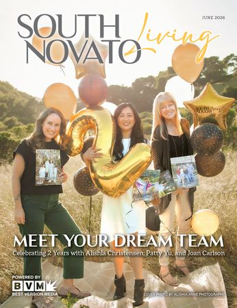
I’m happy to be able to address you again right here in your South Novato Living Magazine. I’m Joan Carlson of Splashpaint Creative, and It’s my pleasure to present another Case Study from my portfolio.
WEBSITE AND LOGO DESIGN FOR MARK W. DAWSON MEDIATION
Mark Dawson is a natural communicator, entrepreneur, and networker. He’s lived, worked in Novato for decades. People who know him, know he’s a skilled negotiator— adept at facilitating elegant solutions.
I met Mark and his wife (and a group of their best friends) at Sausalito’s big Christmas tent event, where Santa arrives via the Sausalito Ferry and then presides over a magical night of music and festivity. It was early in the “go-go 90s” and Mark started referring me for design projects almost immediately. He was well-connected in the Restaurant scenes in Marin and SF, and put me in touch with the Marketing VP at Pier 39 Restaurants, where I proceeded to add many dining-industry projects to my portfolio.
Mark and his wife are a great inspiration, and have been helpful business mentors for me. They introduced me to my BNI chapter, where I’ve been a member as that chapter’s Graphic Designer, for nearly 8 years.
Mediation is perfect right livlihood for Mark. One focus he prioritizes is benefitting youth who find themselves dealing with the legal system for whatever reason. He’s a Court Appointed Special Advocate (CASA), for children in the Marin County Juvenile Court System, and a Facilitator for Peer Solutions Hearings within the Youth Transforming Justice organization, among others.
DESIGN OF THE BRAND LOOK AND FEEL FOR MARK W. DAWSON MEDIATION
By the time Mark asked me to design his new brand and website, I already had a very good sense for the look and feel that would describe his value proposition perfectly. I put a lot of thought into the brand and business card design to make sure it would reflect his strength, calm, and professionalism — and I designed the website to reinforce those impressions.
It turned out that the types of information we needed to showcase would lend itself well to using a website architecture style called a One Page Scrolling site. This means the site content is stacked vertically on a single page. Clicking a button in the main menu at the top causes the desired info to scroll into place under the header. It’s called a “sticky header” because of the way it stays at the top of the window.
This has been a very satisfying branding, logo, and site design project for me, and I know these strategic solutions will serve Mark’s business very well going forward.
You don’t have to be a company to work with me. I do all sorts of family projects too, from flyers, photo repair, color correcting and editing, special-day posters, illustrations, and family coffee table books too! I’d like to be your go-to trusted creative resource.