Button Text That Gets Clicks: The Secrets to High-Converting CTAs

August 19, 2025
Industry Trends
Button text is one of the simplest, yet most overlooked tools for business owners looking to drive website conversions. Selecting the proper call-to-action (CTA), a prompt that encourages potential customers to take the next step, can ultimately be the difference between a bounce and a buyer.
Consumers often decide whether they will engage with content or move on in a matter of seconds. Clear, action-oriented CTA buttons can help guide users, while influencing how they interact with your brand. They can also help improve the bottom line for your business, as a clear, specific CTA can help increase conversion rates by 161%, according to wisernotify.com.
Whether on a digital ad, website landing page, email or mobile app, optimizing and strategically placing CTA buttons can significantly boost your brand. To do this, businesses need to understand what motivates someone to click a button, where the most effective CTAs appear and why certain words perform better than others.
Here’s a closer look at the psychology, strategy and data behind high-performing CTA button text, and how it can help drive conversions for your business.
The Power of the Button: Why CTAs Matter
Buttons are typically the final gate between user interest and user interaction. Small prompts such as “buy now,” “learn more” and “get started” can ultimately carry significant influence in the customer journey.
A well-crafted CTA button that tells users what to do and what value they will get from taking action can factor into several business outcomes, including increasing click-through rate (CTR), driving sign ups, boosting purchases and supporting lead generation.
Color, shape and placement are important factors for high-converting CTAs. However, messaging within the button often does the heavy lifting, as users are typically motivated to click based on the text they see. Users tend to scan pages for relevance, and if your CTA doesn’t stand out or its value isn’t immediately clear, they are prone to skipping it.
It’s important for businesses to define CTA goals while focusing on button design, including concentrating on specific messaging, preventing user confusion and boosting conversion rates. CTA goals and designs should also consider what stage of the marketing funnel consumers are entering. Most often, a motivating CTA driving a purchasing decision will come at the bottom of the funnel.
What Button Text Actually Gets Clicks?
No one specific CTA button is the ultimate answer for success, but several can work well for businesses depending on their marketing strategy. Ultimately, CTAs should be easy to identify, come across as simple and deliver a compelling message that invokes positive emotion, promotes value and makes a user want to take action. This can be done through identifying customer pain points, understanding motivations and personalization. Here’s a closer look at what businesses can do when it comes to creating valuable CTAs through button text.
1. Be clear, not clever
Creativity never hurts, but clarity is a must. While buttons like “Submit” or “Click Here” send a clear message, they don’t convey the value that can lead a user to click. Some high converting alternatives may include:
- “Download my free guide”
- “Get your quote”
- “Start my free trial”
These CTAs are clear, direct and specific, while displaying ownership, benefits and personalization. Additionally, businesses should aim to avoid vague words, and clever phrases that force users to think. A confused visitor usually won’t click.
2. Use first-person language
Switching to first-person pronouns in your CTAs can significantly increase conversions. Some marketing studies have seen as high as a 90% CTR boost by doing so. As a result, businesses should say:
- “Start my free trial” rather than “Start your free trial”
- “Create my account” rather than “Create your account”
First-person language helps personalize the experience for consumers while making the action feel user-centric. According to Hubspot, personalized CTAs perform 202% better than regular CTAs.
3. Inject urgency and value
Driving urgency and presenting value are important parts of marketing strategies, particularly with CTAs. According to moldstud.com, CTAs that incorporate a time-sensitive element result in a 35% higher CTR.
Using time-sensitive or benefit-driven language can compel users to take action quickly. Some examples of this include:
- “Save my seat” (for ticketed events)
- “Claim your discount now”
- “Get instant access”
Time-sensitive words like “now,” “today” or “instant” communicate immediacy. Pairing these with tangible benefits helps increase click potential.
Why Design and Context Matter For High-Converting CTAs
Having the right button text to attract consumers is crucial. However, design and context also remain integral parts of CTAs that lead to clicks.
Button placement and context
CTAs perform best when they are:
- Placed above the fold (visible without scrolling), with wisernotify.com noting that CTAs placed above the fold outperform those placed below by 304%
- Repeated throughout long-form content
- Used after trust-building situations like testimonials, reviews or benefits
Heat-mapping tools can be beneficial when exploring where to place a CTA button, as they allow businesses to see where users are most frequently clicking or hovering on their website.
Buttons should also be large enough to be easily seen, but not so big that they overwhelm users. Each button should feel like an inviting and logical next step, not a hard sell.
Button colors and whitespace
Button color and how it contrasts with the colors surrounding it can play a big role in CTR. A study from J Suresh Kumar discovered that color can influence 85% of purchasing decisions.
Many businesses adhere to this when creating CTAs on digital and print ads, or their websites, often picking one “action color” to be placed on links and buttons. Contrasting colors further help draw attention. Using complementary colors on opposite sides of the color wheel, like warm colors (red, orange and yellow), alongside cool colors (green, purple and blue), can quickly attract the eyes of users.
Here’s a closer look at some colors that can work best for high-converting buttons, courtesy of Hubspot:
- Orange – displays confidence, creativity and boldness while also exuding energy, excitement and urgency
- Red – a bold color related to excitement, power and passion, often driving urgency with its attention-grabbing appeal
- Blue – displays security, strength and trust, often making businesses look more dependable
- Green – a color often associated with relaxation, health, prosperity and growth, often utilized by food and wellness brands
- Yellow – seen alongside youthfulness, positivity, happiness and optimism, standing out with brightness while invoking excitement
- Purple – related to royal and prestige, invokes wisdom, wealth and sophistication, often showcasing premium quality
- Pink – often associated with femininity, offers an accessible feel through its youthful and playful style
- White – gives off a clean, minimalist look that contrasts well with black
- Black – displays a sophisticated, powerful and sleek look that often promotes luxury
Meanwhile, it is also suggested that businesses utilize whitespace around buttons, helping guide eyes toward the CTA. Subtle elements like shadows or hover effects can also promote clicks, as can images of real people looking toward a button, as humans are naturally inclined to look where others look.
Mobile-first thinking
With a continually increasing number of users taking action on mobile devices, buttons should cater to a mobile interface by being:
- Tap-friendly
- Well-spaced
- Center-aligned or thumb-reachable
Even a persuasive-looking CTA will have trouble converting if the button is hard to find or press. According to w3.org, buttons should be at least 44 x 44 pixels to ensure that they’re easily accessible on both mobile and desktop devices. According to wisernotify.com, optimizing CTAs for mobile devices can improve conversion rates by 32.5%.
Words That Convert: Top CTA Examples By Intent
Businesses can use a variety of phrases when crafting high-converting button text, but here are some common and successful CTAs to consider.
Lead Generation
- “Reserve your spot”
- “Get a free estimate”
- “Try it risk-free”
Sales and Ecommerce
- “Add to my cart”
- “Buy now and save 20%”
- “Claim my discount”
SaaS/Subscriptions
- “Start your free trial”
- “Schedule a demo”
- “Join free for a month”
Educational/Informational
- “Read the full guide”
- “Learn how it works”
- “Talk to an expert”
Community and Engagement
- “Join the community”
- “Share your thoughts”
- “Become a member”
Several of these examples include specific power words that can be added to button text to appeal more to customers. Some of the most notable are:
- Best – appeals to users by suggesting the highest quality or performance
- Discover – encourages users to check out something new and exciting through curiosity
- Easy – makes the message feel more attainable and achievable
- Exclusive – helps users feel valued by promoting access only available to some of the audience
- Free – attracts attention by offering something of value without a cost
- Guaranteed – promotes trust and security for consumers with mitigating risk
- Instant – appeals to users seeking a quick solution or access
- Limited – drives urgency by making an offer appear time-sensitive and scarce
- Now – makes users feel that they need to act quickly or with immediate action
- Save – promotes benefits and value to users with a deal or discount
Common Mistakes to Avoid That Can Kill Clicks
Even well-designed buttons can fail if messaging misses the mark. Here are some common pitfalls to avoid when adding button text.
- Being too generic or overusing words – Using something too simplistic such as “submit” doesn’t explain what is happening or what benefit the user is going to get. In addition, overusing simple words can also be a turnoff when it comes to your CTA buttons. The goal should be to use language and tone that will engage your audience, keeping it simple, yet appealing.
- Misplacing the button in the wrong spot – One of the biggest reasons buttons work stems from their placement, particularly when shown on a website or landing page. Buttons that are difficult to spot or lost within other graphics or text are less likely to generate clicks.
- Coming off as pushy – Businesses want to be persuasive, but it’s important not to be overly pushy. Something like “Buy now or miss out forever!” comes off as a bit extreme and may trigger skepticism.
- Making a message difficult to read – CTAs should usually be short, typically running between 2-5 words. Over explaining can dilute urgency and look clunky. In addition, using a hard-to-read font can be a turnoff.
- Mismatching with page intent – Each button must align with the content on the landing page that it is taking users to. Something like “get started” shouldn’t be asked on an informational page. Lining up CTAs and landing pages may also enhance user trust and brand retention.
- Placing too many CTAs in one spot – Users shouldn’t be overwhelmed by multiple CTAs in one spot. A secondary CTA that complements a primary CTA button is typically fine, but it is often wise to avoid making users choose between multiple primary CTA buttons in the same location.
- Overwhelming images – It is generally recommended to place an appealing or high-quality image near a CTA button to help it stand out. However, it is important to use imagery strategically, as a clutter of images could make a CTA button difficult to find.
While CTA buttons may be small, they’re pivotal and persuasive in guiding behavior and driving conversions. Every interaction along the customer journey is important, and the rise of personalization tools makes CTAs a valuable opportunity to engage with potential clients.
Testing Can Help Optimize Your CTA Strategies
Every facet of a quality marketing strategy should be tested and analyzed, from the top of the funnel to the bottom of the funnel. CTAs, which are typically bottom-of-the-funnel tactics, are no different, as measuring their success can help businesses fully optimize their marketing plan.
Businesses will often find that no audience is the same. That makes A/B testing with your CTA buttons critical. According to scoop.market.us, A/B testing on CTA buttons can lead to a 49% improvement in CTR. That begins by testing one variable at a time:
- Wording: “Start free trial” vs. “Try it free”
- Pronouns: “Get my quote” vs. “Get your quote”
- Urgency: “Download now” vs. “Download guide”
Various tools such as Google Analytics can help track engagement and conversion metrics. Specific metrics businesses should monitor include CTR, conversion rate, bounce rate and time on site.
Examples of CTA Buttons in Action
Many local businesses have eye-catching CTA buttons on their websites. Here are some examples:
Cleaning Lovers – This Virginia-based cleaning service features a couple of CTA buttons toward the top of its homepage, including an attention-grabbing blue button with lead generation text encouraging users to “Get a Free Estimate Now.”

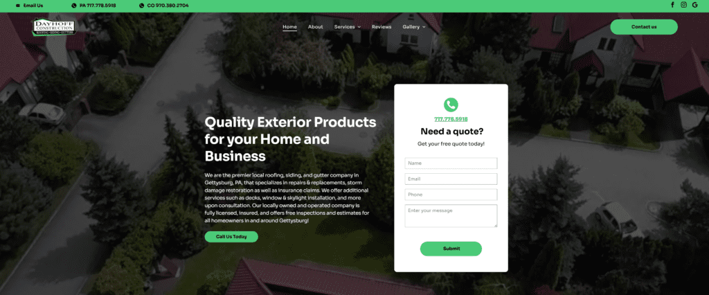
Dayhoff Construction – This locally owned and operated construction firm incorporates multiple CTA buttons above the fold, but avoids overwhelming users between spacing and imagery. The green color of each button stands out, while each CTA gives users a slightly different option of getting in touch with the company, between “Call Us Today,” “Contact Us” and “Submit.”
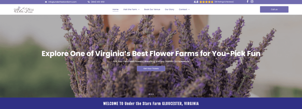
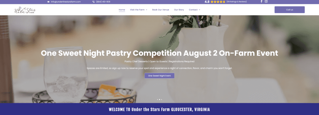
Under the Stars Farm – This 12.5-acre lavender flower farm, which offers consumers unique dining experiences, creative workshops and the opportunity to hand-pick their own flowers, employs carousel imagery featuring three different pictures and CTA buttons on its homepage. The first page introduces the farm with an encouraging CTA of “Get Your Tickets.” The second image advertises an upcoming event with the button text featuring the name of the outing, “One Sweet Night.” The third carousel employs users to “Plan Your Getaway.” Not only will the button text motivate users, but the beautiful background imagery and purple color of the CTA button mix well, giving off a sense of high-end prestige.

Best Version Media Can Help Your Business Implement High-Converting CTAs
Best Version Media can help your business implement high-converting CTAs through our online presence and digital advertising management.
BVM oversees 13,000+ digital ad campaigns that put businesses throughout North America in front of a wide audience on both display and social platforms. In addition to digital ad campaigns, BVM also manages listings and reviews, ensuring businesses can optimize their online presence.
Connect with BVM today to further enhance your marketing strategy.